
Responsive design is no longer a buzzword that web designers and tech-heads talk about in meetups and events. Gone are the days when frontend designers could decide whether to make their website responsive or not. New devices and the rise of the mobile web has made responsive design a necessity. Research shows that by 2019, 63.4 percent of all mobile phone users will access the Internet from their mobile phone.
If you are not sure what responsive design is all about, why you need it in your websites or web app and how to use it, then you have come to the right place. In this article, you will first of all get to know exactly what responsive web design is all about, why it must be part of your frontend design strategy and the easiest and best ways to deploy it on new and existing designs.
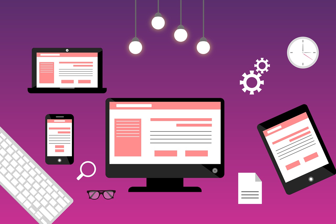
What Is Responsive Web Design?
So what is responsive design? There are numerous descriptions that you may come across on the web and elsewhere. Responsive design simply refers to a design approach where a web interface is made to appear as intended regardless of the screen size it is being viewed on. A web user could be using a wide-screen desktop monitor, a laptop screen, tablet while others could be on their phones. Adhering to responsive design rules will ensure all these users see all the elements in your web interface as you intended them to be viewed. Traditional fixed designs were bad for different screen sizes as some elements were either hidden off-screen necessitating continuous scrolling or just truncated and not visible at all for smaller screens.
Why Responsive Design Is a Requirement Today
In the past, a good percentage of the web was made for the standard desktop screen. This was because not many users were comfortable surfing the web on their tiny and sometimes clumsy mobile devices. However, technological advancements in mobile allowed more powerful consumer device like smartphones and tablets to take over the market. Fixed size pages give the user a horrible surfing experience as elements may be distorted, invisible or users will be forced to scroll horizontally in order to view the hidden columns.
A bad experience will most likely send most users away from your website before they even get to access any of its content. This will not only hurt your sales but also ranking on search engines like google. Search algorithms perceive these usage patterns as an indicator that you have bad or irrelevant content. Responsive design is the way to go if you want all visitors to experience your beautiful design in all its glory-as you intended it to be.
How to Easily Make Your Designs Responsive.
Now that you know what responsive design is all about and why you need it, you might be wondering how to go about making your design responsive and friendly to all devices out there. If you are using a CMS like WordPress and Joomla, make sure the theme you choose has a responsive design. This can be established from the theme’s description from the vendor’s website or by running a simple test using online tools.
Frontend designers coding web interfaces from scratch can make use of responsive design rules which include but are not limited to;
- Relative positioning
- Setting The Viewport
- Using the max-width Property
- Using percentages as opposed to fixed sizes
- Using Responsive Text Size with VW (viewport width) units
Responsive web design can lead to satisfying experiences for users regardless of the devices they use to access your website. However bad implementations can also lead to problems. Make sure you test your design before deployment.